Favorite Type Designer: Stephen Powers (ESPO)
Process For Type: All my work starts off as a pencil sketch on paper, even basic looking type. I like to start off by creating loose bounding shape forms and slowly tighten everything up as I go along. I usually count the amount of letters in the word(s) and then divide up space for them with lines, factoring in kerning and differing letter widths. Spacing is really key, for me. I try to make sure everything is spatially correct, well-framed, and balanced. From there, I get it as tight as I need to, and then scan it. Then I get all fancy and exact by redrawing it in Adobe Illustrator. Sometimes, the finished type turns out pretty different from it’s sketch, because I can do certain things easier and quicker drawing on the computer. I use a mouse, by the way. I haven’t been able to get used to a tablet.
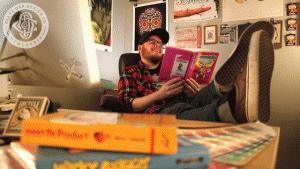
Inspiration: I collect a bunch of books and vintage stuff: patches, pins, toys, pennants, advertisement, posters, comics, skateboards, etc. I surround myself with these things and get inspired from them constantly. So I’d say I’m mainly inspired by design and art that was created before I was born (1984). That’s not to say I’m not inspired by new work, because I am, but that new work was probably inspired by something old… I look on design sites from time to time, but not as much these days. That said, I recently found a rad new, vintage design blog.
Last Three Songs I Listened To: I listen to full records more than individual songs, so here are three records I’m listening to:
Paint It Black – “Invisible, EP”
Wavves – “Afraid of Heights”
Kitten – “Cut It Out, EP”

Each Tuesday we’ll feature a designer who loves type or a type that designers love. If you would like to be featured in Type Tuesday, send your portfolio or website link and a short bio to socialmedia@orlando.aiga.org.